Lesson 1.5: Put it all together to explore the 2023 fish survey#
The 1998 results showed health hazards from fish with high mercury motivated the tribe to undertake a project to remove contaminated sediments. In 2023, fifty years after the initial measurements, K’avi fisheries managers conducted another survey of mercury levels in fish. They carefully collected data from the same sites they surveyed in 1998.
We will now download and analyze data collected from this second survey (fish_2023.csv).
Our goal is to see how successful the sediment removal efforts by the tribe were in reducing the amount of mercury present in the fish. We will do this by comparing our findings from the 1998 dataset to our current findings in the 2023 dataset.
Today’s exercise allows you to apply the lessons you learned about coding in the previou lessons to a new dataset.
Load in and explore data#
Like we did in Lesson 1.2 of the first module, we first need to load in our datasets before we can explore them!
We will repeat several of the steps we took to investigate the 1998 data with the new 2023, fish data. These steps are important because they allow you to check to see if the data loaded properly; to check to see if they make sense; and to start thinking about their implications for our scientific question, “Did the sediment cleanup efforts help the health of the fish and the community?”
# start with loading the tidyverse package and previous data frame
library(tidyverse)
# new package we are using is 'patchwork'
install.packages('patchwork')
library(patchwork)

# if running in google colab, uncomment and use the following line:
# fish_1998 <- read.csv("https://raw.githubusercontent.com/rachtorr/IndigenousEnvDataSci.github.io/refs/heads/main/MOD1/fish_1998.csv")

# previous data frame 1998
fish_1998 <- read.csv("fish_1998.csv", header=TRUE, sep=',')
Error in library(tidyverse): there is no package called ‘tidyverse’
Traceback:

1. stop(packageNotFoundError(package, lib.loc, sys.call()))
# if running in google colab, uncomment and use the following line:
# fish_2023 <- read.csv("https://raw.githubusercontent.com/rachtorr/IndigenousEnvDataSci.github.io/refs/heads/main/MOD1/fish_2023.csv")

# This code brings in the 2023 dataset as a dataframe.
fish_2023 <- read.csv("fish_2023.csv", header = TRUE, sep = ',')

# preview
head(fish_2023)
| X | length | mercury | |
|---|---|---|---|
| <int> | <dbl> | <dbl> | |
| 1 | 1 | 40.16618 | 0.1993075 |
| 2 | 2 | 37.33182 | 0.2296922 |
| 3 | 3 | 40.93916 | 0.2300245 |
| 4 | 4 | 75.38346 | 0.9531401 |
| 5 | 5 | 50.42610 | 0.2909152 |
| 6 | 6 | 66.00687 | 0.6845460 |
🧠✍️ Class Questions
What are the variables that the 2023 data set contains?
In the code below, what would go in the parentheses of
dim()? How many rows and columns are there?
# fill in the blank - what would you put inside dim() to learn the dimensions
dim()
- 300
- 3
Descriptive statistics#
According to the EPA, the maximum safe level of mercury to be consumed is around 0.46 ug/g/day. Tribal fishery managers are interested in how mercury levels in fish belly fat have changed since 1998 to 2023, now that the rivers have been cleaned.
Below, we will analyze data points from the fish_2023 dataframe to answer
these questions. We will start to do this by running some basic summary statistics
on the mercury data from 2023.
🧠✍️ Class Question:
Work together to write code that tells you the descriptive statistics (median, mean, minimum, meximum, etc) for the mercury in the fish collected in 2023.
How do the mean and median values of mercury in 2023 compare to the EPA’s standard?
Do the descriptive statistics suggest that the mercury levels in fish have improved since 1998?
# add code for descriptive statistics here
    Min.  1st Qu.   Median     Mean  3rd Qu.     Max.
0.002966 0.179127 0.277825 0.336867 0.423762 1.623886
By running these summary statistics, we can see that mercury levels in fish caught in 2023 are lower than they were in fish that were caught in 1998, which is good news!
However, some fish in 2023 still have unsafe levels of mercury. Tribal fisheries managers know that people who catch these fish can’t measure the mercury content, but they can measure the length of the fish they catch.
Data visualization#
In the next section, we will make graphs that will show us if the length of fish that are safe to eat has changed since 1998. There are three goals for making these graphs:
(1) You will learn a little more about making graphs using R. (2) Making these graphs will help us learn whether the sediment cleanup resulted in safer fish in 2023. The graphs let us look at all the data (not just the descriptive statistics). (3) You can use the graphs to decide what length of fish is safe for the community to eat. Then you can think about how to convey this information to the community.
Our goal is to show two plots next to each other. First we’ll make the plot of the relationship between mercury and fish length in 1998 again. Then we’ll make a very similar plot for the fish from 2023. Then we’ll plot them side-by-side, which will let us answer the questions we have about how the healthiness of fish has changed over the 25 years since 1998.
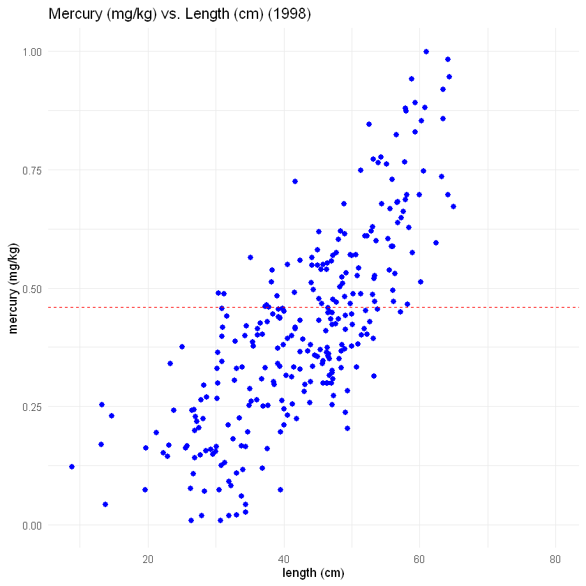
Our first step is to make a scatter plot of mercury and fish length from 1998. We’re going to use the same code that we used before with one small change: We will set the range of the y-axis (the vertical axis), so that it will be the same as the y-axis of the 2023 data. That will help us compare the two graphs later.
Look more carefully at the code this time. You will see things that look similar to the code you’ve run before. This is a good starting point for learning to make graphs in R. To test yourself, see if you can describe what each line of code does. What makes sense? What seems confusing?
# This code is the same code we used before.
# If you look at each line, what makes sense? What is confusing?
  plot1998<- ggplot(fish_1998, aes(x = length, y = mercury)) +
      geom_point(color = 'blue', size = 2) +
      xlab("length (cm)")+
      ylab("mercury (mg/kg)")+
      ggtitle("Mercury (mg/kg) vs. Length (cm) (1998)")+
      geom_hline(yintercept = 0.46, linetype= "dashed", color = 'red')+
# This is the only NEW line of code.
# We use the command ylim() to set the range of the y-axis
# The y-axis in this plot will start at 2 mg/kg mercury and end at 6 mg/kg
# We'll use the same range for the scatter plot of the 2023 data.
# That will make it easier to compare the fish across the two years.
      ylim(0,1) +
# We will specify the same "minimal" theme we used before.
      theme_minimal()

# Now let's plot the data from 1998
plot1998
Next, we’ll make the same graph for the 2023 data. The code below is almost the same as the code you just saw. The only difference is that we make plot2023 using the 2023 fish data (in the last code chunk, we made plot1998 using the 1998 fish data).
This is a good opportunity to point out some tips that will make you a better data scientist:
Feel free to use code that worked before. A nice thing about coding is that if you’ve done something once, you then have the code written down for future use.
However, you have to be careful that you modify the code for the new situation. In this case, we have to change all the references to 1998 so that they refer to the 2023 data. We should also rename all the objects we make (like the graph that is called plot2023), so that we don’t accidentally replace the old objects with the same name.
It’s really useful to look through the code line-by-line, so that you can catch all these little mistakes. You can even have a friend look at your code to see if it makes sense to someone else.
If you follow this advice, things that seem difficult now become easier soon!
Here, we’ll make our scatter plot for the 2023 fish length and mercury data:
# See if you can understand the code below. What changes have been made?
plot2023 <- ggplot(fish_2023, aes(x = length, y = mercury)) +
  geom_point(color = 'green', size = 2) +
  xlab("length (cm)") +
  ylab("mercury (mg/kg)") +
  ggtitle("Mercury (mg/kg) vs. Length (cm) (2023)") +
  geom_hline(yintercept = 0.46, linetype= "dashed", color = 'red') +
# We use ylim() to match the y-axis here to that of plot1998
  ylim(0, 1) +
  theme_minimal()

plot2023
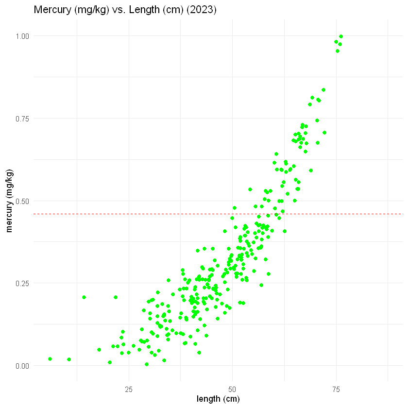
The plot for the 2023 data looks pretty good. A side-by-side comparison with the 1998 data would help us see how much the healthiness of the fish has improved over the intervening 25 years.
Since we defined the two graphs as objects in R (plot1998 and plot2023), and since we’ve loaded the package patchwork we can use the simple line of code below to plot the data from the two years side-by-side.
# change settings for plots to show up
options(repr.plot.width = 10, repr.plot.height = 6)

# plot from 1998 next to plot from 2023

# get scales to be the same
plot1998 = plot1998 + scale_x_continuous(limits=c(0,90))
plot2023 = plot2023 + scale_x_continuous(limits=c(0,90))

# we can use the patchwork package to be able to add plots
plot1998 + plot2023
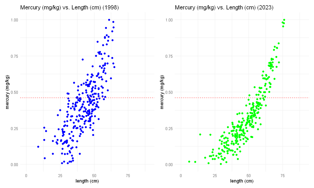
🧠✍️ Class Questions:
What is the safest large size fish to eat based on the 2023 dataset? How does this compare to the safest largest size fish that could be eaten based on the 1998 dataset?
Based on these plots, do you think the efforts since 1998 to clean mercury from the sediments were successful?
Work with a group to describe the evidence from these graphs for the success of the clean-up effort in a way that would be useful for the K’avi community.
Comparing groups in the same plot#
Using ggplot(), we can adjust the settings inside geoms to include both groups (in our case years) inside the same plot. Below are two different examples, a bozplot and a scatter plot with the year set to color. Look at the code below to see what is different.
# 1. boxplots
ggplot() +
  geom_boxplot(data=fish_1998, aes(x="1998", y=mercury, fill="1998")) +
  geom_boxplot(data=fish_2023, aes(x="2023", y=mercury, fill="2023")) +
  geom_hline(aes(yintercept=0.46), color="red", linetype="dashed") +
  labs(fill="year", x="year", y="mercury (ug/g)") +
  theme_minimal()

# 2. scatter plot with color = year

ggplot() +
  geom_point(data=fish_1998, aes(x=length, y=mercury, color="1998")) +
  geom_point(data=fish_2023, aes(x=length, y=mercury, color="2023")) +
  geom_hline(aes(yintercept=0.46), color="red", linetype="dashed") +
  labs(color ="year", y="mercury (ug/g)", x="length (cm)") +
  theme_minimal()
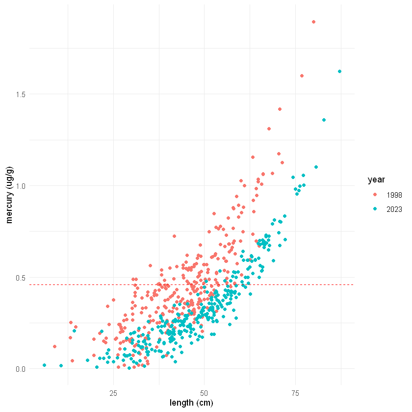
🧠✍️ Class Questions:
How does the different ways of visualizing the data, as two separate plots and as different groups on the same plot, affect how we are able to interpret the data?
Can you think of scenarios when it would be more useful to use one or the other?
Lesson 1.5 Recap#
In Lesson 1.5, we have reviewed:
Reading in and previewing a data frame of the 2023 fish survey
Calculating descriptive statistics
Data visualization with
ggplot()Comparing different groups in data visualization